Seasonality Is Not a Signal: How to Use Gold's 10-Year Weekly Map Without Getting Fooled
Seasonal charts are the most over-sold tool in trading — a smooth average curve that looks like a forecast and is not. Here is what a seasonal map actually measures, the three numbers that make it usable, and the rule for when to let it change a trade.
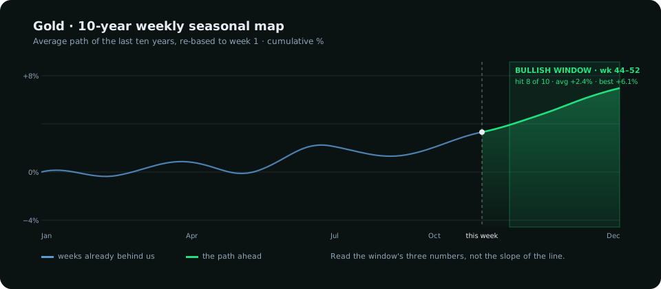
Every October the same chart does the rounds: a smooth line showing that gold "tends to rise" into year end, with this year's price drawn on top. It looks like a forecast. It is an average of ten lines, and an average of ten lines is smooth whether or not any one of them was.
Seasonality is a real effect in some markets — there are physical, fiscal and calendar reasons behind parts of it — and it is a worthless one if read the way the chart invites you to read it. This post is about reading it the other way.
What the curve is actually made of
A seasonal map takes each of the last ten years, re-bases every year to zero on the first week, and averages the ten paths week by week. That is all. Three consequences follow that the smooth line hides:
- Ten is a tiny sample. Two unusual years — 2020's pandemic bid, a central-bank-buying year — can move the whole average by themselves.
- The average hides disagreement. A "+2% in November" average can be five years at +6% and five at −2%. The line looks confident; the data is split.
- Re-basing creates a drift. A market that rose over the decade will show a rising seasonal line regardless of any calendar effect. Part of gold's "year-end rally" is just that gold went up.
The three numbers that make it usable
Ignore the curve's shape and look at three numbers for the specific window you care about:
- Hit rate: in how many of the ten years did the market actually move in the direction the average says? Eight of ten is a tendency. Six of ten is a coin flip with a story attached.
- Average move, with the best and worst year beside it. A +2.4% average built from a +9% year and nine flat ones is not a +2.4% tendency.
- Sample size: how many of the ten years actually contain the window? A market that changed character five years ago has five relevant years, not ten.
The terminal shows these three for every seasonal window it marks and for this week and next week individually, with a confidence label (high, medium, low) derived from them. The label is the honest version of the curve: "bullish, high confidence" means eight or more of ten years agreed and the average is well clear of zero; "no edge" means the years disagreed. The curve is drawn for context; the label is what you read.
What seasonality is for
Seasonality is a weight on the scale, in the same category as the COT report: slow, background, probabilistic. It is good at three jobs and bad at everything else.
- Choosing between two equal setups. A long in a market entering a strong seasonal window is a better use of risk than the same long in a market entering its weakest weeks.
- Sizing a bias. When the structure is bullish, the positioning is mildly long and the seasonal window agrees with a high hit rate, you have confluence. Size normally. When the seasonal window disagrees, size down — not out.
- Catching the turning points. The weeks where the ten-year average turns are more informative than the slope between them. Markets that have followed the seasonal path closely for several weeks tend to respect the next turning point; markets that have ignored it will not suddenly start.
That last point is the one the terminal measures as tracking: how closely this year has followed the ten-year path so far. A year with high tracking makes the next turning point worth a look. A year with low tracking means seasonality is not the driver this year and you should stop looking at the chart.
What it is not for
It is not a reason to enter. There is no seasonal chart on earth that tells you a Tuesday is a good day to buy gold. The entry comes from the H1 chart — the area of interest, the sweep, the structure shift — and from the session clock. Seasonality only tells you which of your setups deserves the full position.
It is not a forecast of magnitude. "+2.4% average" is the mean of a scatter. The year you trade could be the +9% one or the −3% one. Target structure, not the average.
And it is not stable. The strongest seasonal patterns of the 2000s — the September gold rally built on Indian wedding-season demand — weakened as the gold market's marginal buyer changed. Any seasonal read that has not worked for three consecutive years should be retired, which is why the terminal shows the five-year line next to the ten-year one. Where they disagree, trust the five.
The rule
If you want a single sentence to keep: let seasonality change your size and your patience, never your direction or your entry. Direction comes from structure and the higher timeframes. Entry comes from the H1 trigger inside a killzone. Seasonality decides whether you take that trade at full size or half, and whether you hold for the second target or take the first. Used that way it is a modest, durable edge. Used as a signal it is a story that will cost you the year it fails.
The Seasonality tab shows the ten- and five-year maps for every tracked market with this week, next week and each day of the week read separately; the day read refreshes at the start of every new daily candle. The same read appears beside the setup on Market Trend as a one-line confluence check.
Everything on SMC Terminal is analysis and education, not a recommendation to buy or sell. Past seasonal tendencies do not predict future returns. Manage your risk.
More from the desk
All posts →